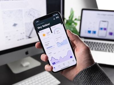

Day 42: Creating a responsive and translated design for the 180 Frontend Challenge. In this article we practically review how to design websites that adapt to all screens and present tips for taking your projects to production along with professional services offered by Q2BSTUDIO.
What is responsive design? Responsive design ensures that a web page adapts to different screen sizes and devices without breaking its layout or usability. It involves using flexible layouts, fluid images that resize automatically, and media queries to adjust styles according to breakpoints.
Recommended folder structure: responsive-layout/ index.html style.css images/ sample.jpg This minimal structure helps you keep simple projects organized and scale later.
Step 1: Basic HTML structure. Here is a simplified example for a page with three sections. The code is shown with escaped characters so you can copy it as is and test it in your editor. <!-- index.html --> <!DOCTYPE html> <html lang=en> <head> <meta charset=UTF-8 /> <meta name=viewport content=width=device-width, initial-scale=1.0 /> <title>Responsive Layout</title> <link rel=stylesheet href=style.css /> </head> <body> <header> <h1>My Responsive Website</h1> </header> <nav> <a href=#>Home</a> <a href=#>About</a> <a href=#>Projects</a> <a href=#>Contact</a> </nav> <main> <section class=card> <img src=images/sample.jpg alt=Sample Image> <h2>Section 1</h2> <p>Example content that adapts to different devices.</p> </section> <section class=card> <img src=images/sample.jpg alt=Sample Image> <h2>Section 2</h2> <p>Responsive designs keep content accessible and readable.</p> </section> <section class=card> <img src=images/sample.jpg alt=Sample Image> <h2>Section 3</h2> <p>Mobile first design to prioritize small screens before scaling up.</p> </section> </main> <footer> <p>© 2025 My Responsive Website</p> </footer> </body> </html>
Step 2: Essential CSS styles for responsiveness. Use Flexbox and media queries. Below is the CSS in escaped format so you can paste it directly into style.css. /* style.css */ * { margin: 0; padding: 0; box-sizing: border-box; } body { font-family: system-ui, sans-serif; line-height: 1.6; background: #f8f9fa; color: #333; } header { background: #007bff; color: white; text-align: center; padding: 1.5rem; } nav { background: #222; text-align: center; } nav a { color: white; text-decoration: none; padding: 1rem; display: inline-block; } nav a:hover { background: #007bff; } main { display: flex; gap: 1rem; padding: 1rem; } .card { background: white; padding: 1rem; border-radius: 8px; box-shadow: 0 4px 8px rgba(0,0,0,0.1); flex: 1; } .card img { max-width: 100%; border-radius: 6px; } footer { background: #222; color: white; text-align: center; padding: 1rem; margin-top: 2rem; }
Step 3: Media queries and mobile first approach. We recommend starting with one column for mobile and expanding to multiple columns on larger screens. Example of escaped media queries: @media (min-width: 768px) { main { flex-direction: row; } } @media (max-width: 767px) { main { flex-direction: column; } nav a { display: block; border-top: 1px solid #333; } }
What you will learn with this exercise: mobile first design starting with small devices, flexible layouts with Flexbox, fluid images that do not break the layout, and use of media queries to adjust styles on tablets and desktops.
Professional tips for responsive design: use percentages or max-width instead of fixed pixel widths for greater flexibility; test your layouts on multiple devices and browsers; keep touch targets large enough for mobile users; avoid horizontal scrolling on small screens.
Suggested tasks today: 1 Build the layout exactly as shown. 2 Test on mobile, tablet, and desktop viewports. 3 Customize colors, spacing, and typography according to your style. 4 Upload the project to GitHub or deploy on Netlify and share your work.
Boost your frontend skills: if you want to master responsive design, CSS Grid, and component-based layouts, check out advanced resources and complete projects. We also offer specialized technical training and consulting at Q2BSTUDIO.
About Q2BSTUDIO: Q2BSTUDIO is a company dedicated to custom software and application development with experience in artificial intelligence, cybersecurity, and cloud solutions. We provide aws and azure cloud services, business intelligence services, and custom software development for companies looking to transform processes with technology. We are specialists in artificial intelligence and AI for businesses, creating custom AI agents, Power BI integrations, and data pipelines for analysis and decision-making.
Featured services from Q2BSTUDIO: custom applications, custom software, applied business artificial intelligence, cybersecurity, aws and azure cloud services, business intelligence services, AI for businesses, AI agents, power bi. Our proposal combines strategic consulting, secure and scalable solution design, and full stack development to deliver production-ready products.
How we can help you: we evaluate requirements, propose secure cloud architecture on aws or azure, design and implement custom applications integrating artificial intelligence models and data pipelines for Power BI, and strengthen your systems with cybersecurity practices. If you need AI agents to automate tasks or business intelligence solutions, we work alongside your team to achieve measurable results.
Recommended resource: get advanced material and practical examples at https://codewithdhanian.gumroad.com/l/sxpyzb and complement with professional services from Q2BSTUDIO to take your projects to production.
Final summary: mastering responsive design is key for any frontend developer. Practice with this exercise, apply the professional tips, and take advantage of Q2BSTUDIO services to scale projects toward secure, intelligent, and scalable solutions with custom applications and artificial intelligence.
Contact and next step: if you want us to evaluate your project or help you deploy a complete solution with an emphasis on artificial intelligence and cybersecurity, contact Q2BSTUDIO and request a technical consultation. Include in your message references to custom applications, custom software, artificial intelligence, cybersecurity, aws and azure cloud services, business intelligence services, AI for businesses, AI agents, and power bi so we can prioritize your needs.